About 1 week ago I was asked to take on a small project, to redesign a logo for a non-profit pregnancy services organization. In the next few paragraphs I will share my process with you.
The first thing was to look at their website and gather data about what they already had.

Right from the beginning I saw some major problems with their existing logo design. The site is supposed to make a emotional connection with mostly women who are between the ages of 15 to 25 roughly. The colors are terrible. They are very masculine and software company oriented. The vines appear as outstretched throned bushes much like the vines in the movie cinderella when she falls into the deep eternal sleep. Not a good connotation for a pregnancy website to have. This was clearly done by a website builder with very little knowledge about how to make an emotional connection with the consumer. The first thing I set out to do was to find a more suitable idea for a pregnancy website.

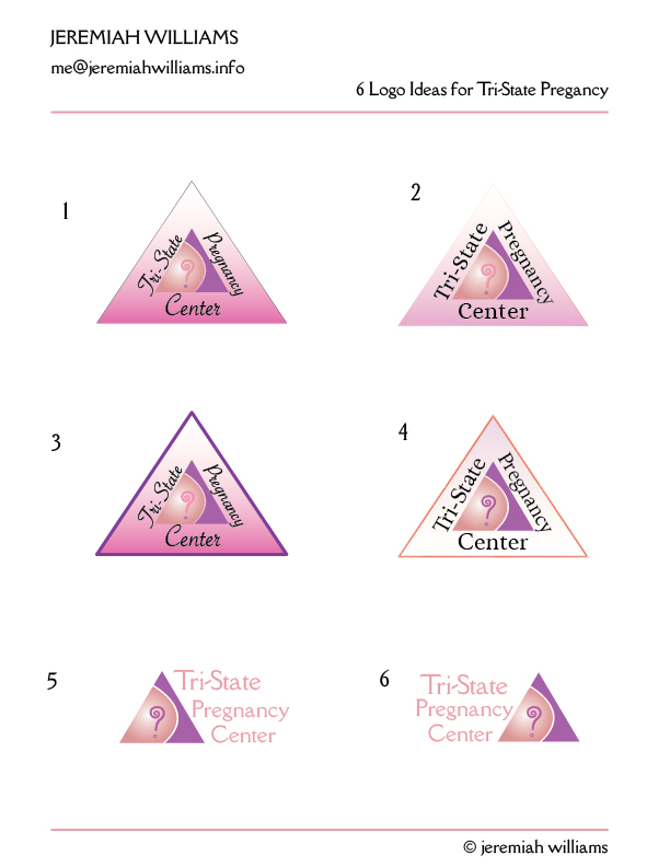
The clues I took were simple. First off, Tri-State means triangle to me, since there are three states or three points of a triangle. Secondly, I decided to stylize the beautiful curve of a pregnant belly with a belly button. Then I decided to add a cute little question mark to the design so it would appeal to those who have questions about what they could do about their pregnancy situation. So I took a question mark and added a spiral in illustrator to it then gave it a stroke to accent it slightly. I wanted it to look like a question mark, not to be a question mark.
Next, I endeavored to create a color palette. I have read enough about color theory and marketing to realize that girls like pinks and purples and variances thereof. So there it was now everything looked good except the typography.
I use mostly the Google Web-font library for my website design, so I decided to test the wording out with these 2500 or so fonts. I really liked the more informal fonts, but hopefully we all know that the readability of the logo gets sacrificed tremendously when we choose a handwritten or script font face. So I knew I had to be careful and ended up using a savoy LET plain 1.0 for the script face. I also liked Alice and lowan old-style for their simplicity and legibility. I finally went with Della Respira because I like the smaller more modern feet of the serif and the roundness of the capital “C” and the width of the capital “T”. I also liked the way it went well with a triangular shape because of the angled counter on the lowercase “e” and the angle of the slanted descender on the lowercase “y”.
So there is a peek inside my process, now if I could only guarantee that the client will fall in love with everything I do, I will be satisfied. We all know that the thrill is in the unknowing and then finding our later that the client hose your design.
Peace and good luck to you all.
